Problems
Does not clearly convey the purpose of the site. Users have said that they feel discougraged and will easily click off after trying to understand it.
Too much information and too hard to read
Overcrowding of images and clothing is hard to see
Text is too small
The buttons are too vague and do not visually grab the users attention
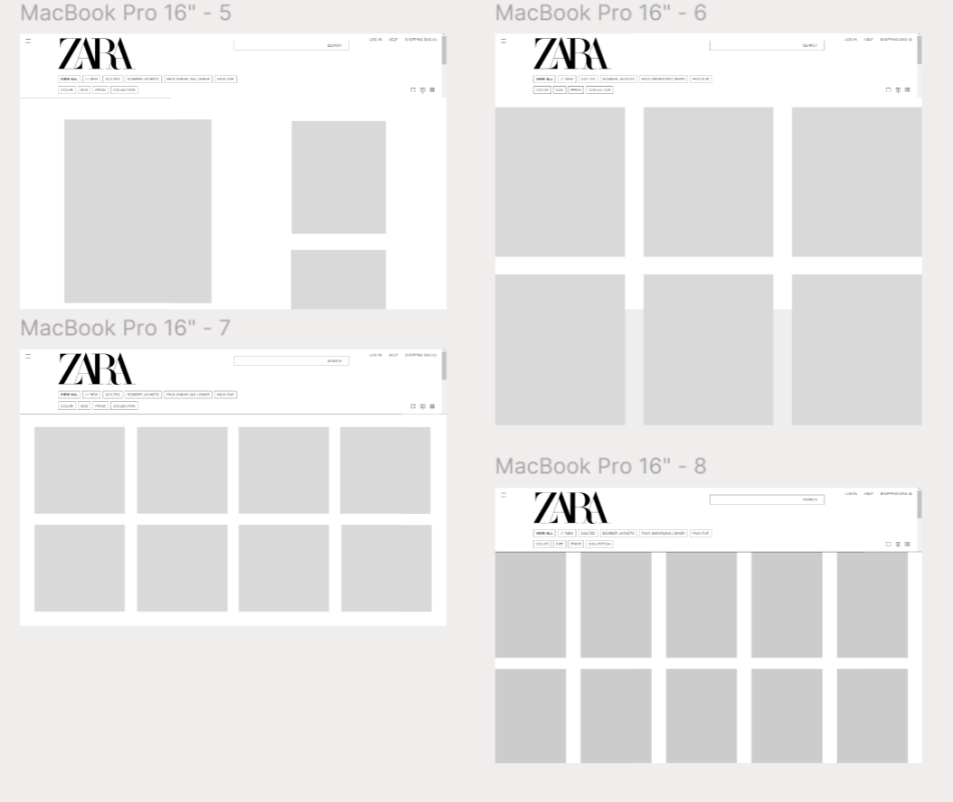
Wireframes
I wanted to keep the editorial style of the pages that reflects magazine layouts. However I wanted to alter it in a way that is easier for the user to intake information and images at a fast pace. Keeping this in mind I took inspiration from Instagram’s layout and played with the size of the images and the geometric composition.
The view button is a unique component of the zara website and is not found on most shopping websites. Which causes confusion, and the feature is often overlooked due to the small size. In addition, the original buttons are not intuitive enough for thr user to translate their iconography to changing the view. I struggled to keep the simplicity of the icon while also making its use obvious.
Final Redesign of Landing Page
Shop By Look
I was inspired by instagrams ability to tap on an image posted and the link to the item of clothing appears. I wanted to add this prototying into the zara website and mix it with their editorial styling as another option for viewing the clothing instead of changing the size of the images.
I then asked them if they have tried the mobile app/ prefer the app or the website?
The majority said they preffered to use it on their computer.
Pain Points
Lacks visual hierarchy
Landing pages risk cognitive load
Univtuitive iconography for viewing buttons
Lacks personalization of shopping experience
Website Versus App
Video of prototyping
Shop By Look PageZara Website RedesignINTRO
This project is self-initiated, inspired by my experiences during online shopping. While navigating the Zara website, I recognized an opportunity to enhance the user experience. Zara is a brand I admire, as do many of my peers; however, it has been widely acknowledged that the website can be challenging to browse. To gain further insights, I consulted several friends regarding their opinions on the website's functionality
After speaking with 5 individuals this is what they said about the website:
Confusing
Hard to navigate
Automatically takes you to the page of the single view
When I click on the product it swipes down but I would swipe left or right
Its like work
Brand Principles
Zara’s website is sleek, modern, and simple. Its color pallete is black and white in order to showcase the fashion. It has an editorial style of a magazine and uses large abstract images.
Redesign
Fix the composition/layout of the clothing images when viewing. Keep the editorial style but simplify.
Create an alternative to the viewing buttons.
Alter the text to be more readable under the Images.
Add a personlization feature of machine learning tech or
I chose to focus on the website rather than the app due to my own preference of the website as well as the preference of the individuals I spoke with. I think that the website needs to integrate UX before the app can be utilized. Once the website increases user cogition then the app can follow and users will feel comfortable enough to chose the app.
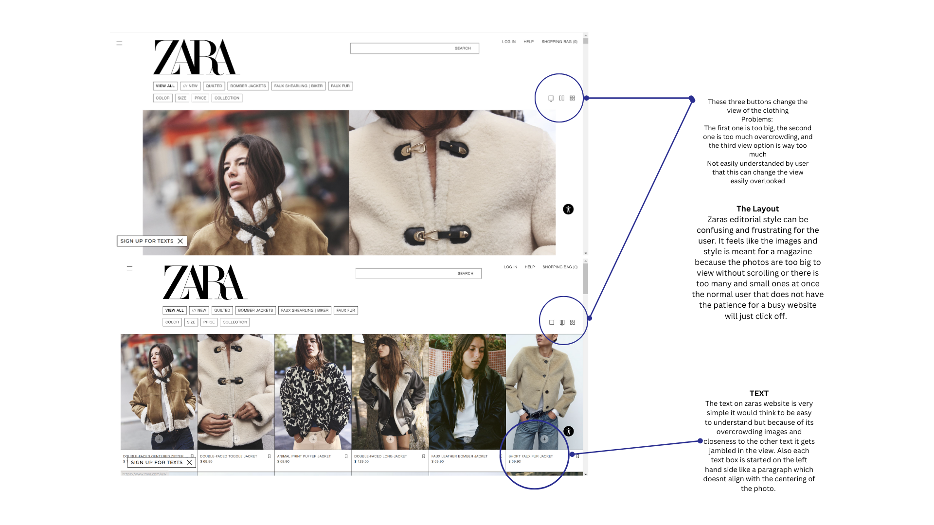

Original Zara Clothing Layout
Figma
Redesigned LayoutDo they enjoy the look of the zara website?
Likes how its minimal
Cool vibe
Enjoys the product images as both in action and white background/on a model
I dont like the weird poses
If I am clicking on a product I want it on a model with a regular picture
Product Principles
Simple
Intuitive
Fast performance
Readability


I kept the black and white grid lines in order to continue the simple style, but I spaced out the images so that there wouldnt be clashing backgrounds too close to eachother.
Add: The viewing button is now changed to a gallery view or a shop by look option. I think the word shop helps the user understand that they can change the view better than the abstract buttons
Text: I changed the text to be centered instead of being on the left marigin. As well as making it bold. I think with this change it makes the text easily readable but not overpowering the image of the clothing.
